
Optimizing Cable CRM for Travel Operations and Support Teams
Users benefit from a modern, intuitive CRM interface designed to streamline workflows, enhance customer interactions, and simplify management tasks.
Project Summary
Cable improves user experience, simplifies operations, and helps agents efficiently assist customers with hotel reservations over the phone.
Our main focuses by Q1 2025..
We are transitioning our travel agents from the long-used Phalanx system to a new and improved interface called Cable.
What's Cable?
Improved Usability
A modern design to make the system more intuitive for agents.
Increased Efficiency
Faster workflows to better serve customers during calls.
Enhanced Management Tools
Easy-to-use features for management.


The outdated interface is clunky and unintuitive, making tasks unnecessarily time-consuming.
Solution
Inefficient workflows force agents to take extra steps or find workarounds for simple tasks.
While experienced agents adapt, new hires struggle, leading to longer training periods.
These inefficiencies slow call resolution times and may impact revenue.
Problem
A modern, intuitive interface streamlines navigation, reducing steps and speeding up tasks.
Optimized workflows and automation minimize redundancy, improving call handling and reducing hold times.
Enhanced management tools provide better reporting, role control, and real-time performance tracking.
Persona


Solve Problems
3 features I redesigned and tested users.
Rebooking hotel room flow
Decision Tree Management
Refund model
Feature testing 1
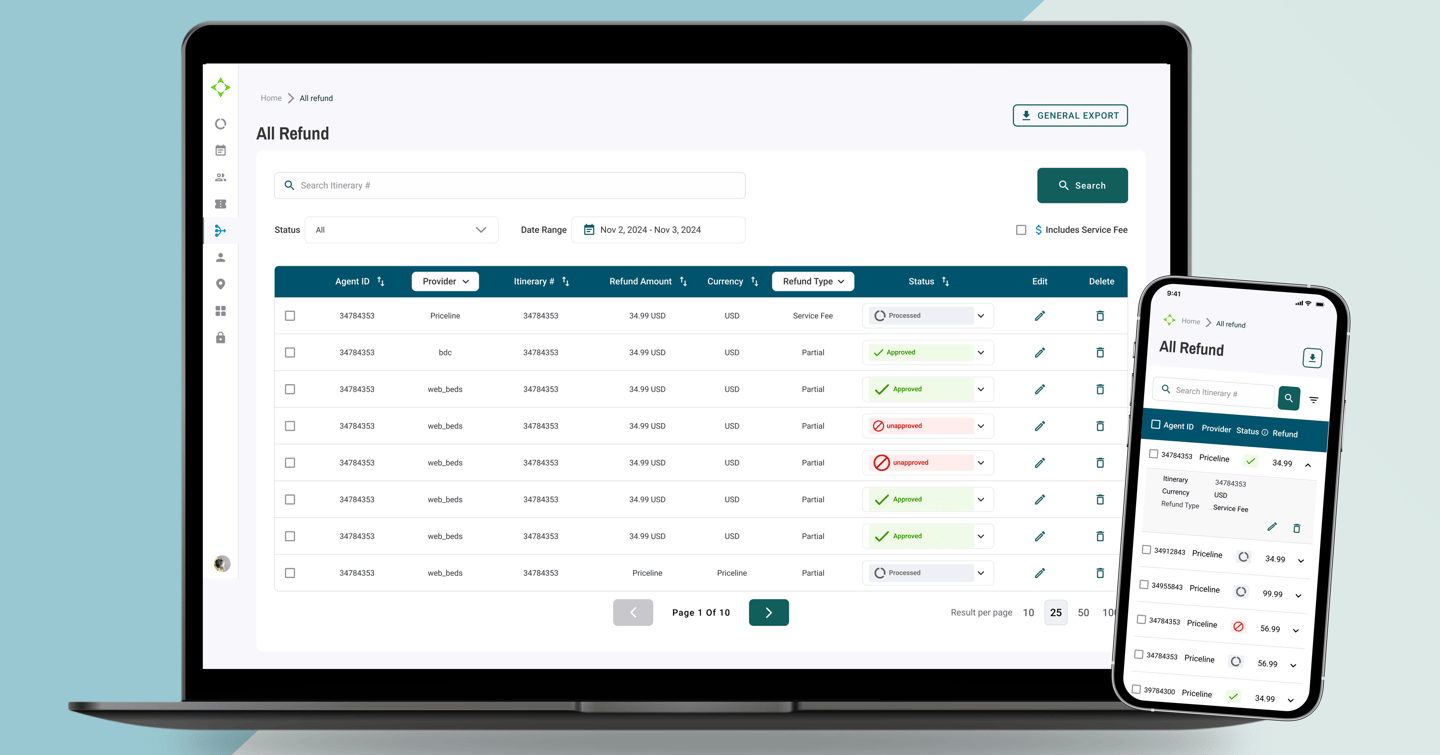
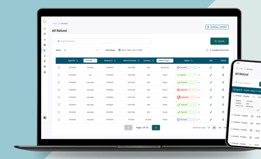
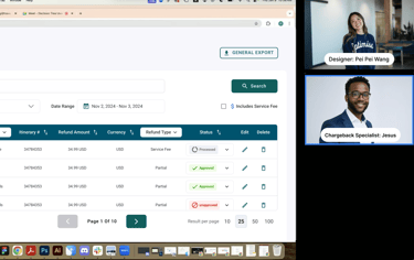
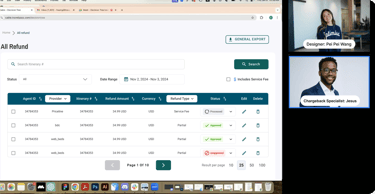
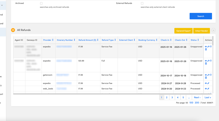
Refund Modal
The Refund Model is used by finance team members to look up charges, gather cost reports, and manually submit refunds to customers.
User Pain Points
I conducted a usability test with Jesus Valladolid, a chargeback specialist. He shared a few pain points:
Phalanx is a 7-year-old legacy refund platform with a cluttered interface and inefficient workflows. UX evaluation uncovered opportunities to streamline tasks, reduce friction, and enhance usability.
Modernizing a Legacy Refund Management Tool
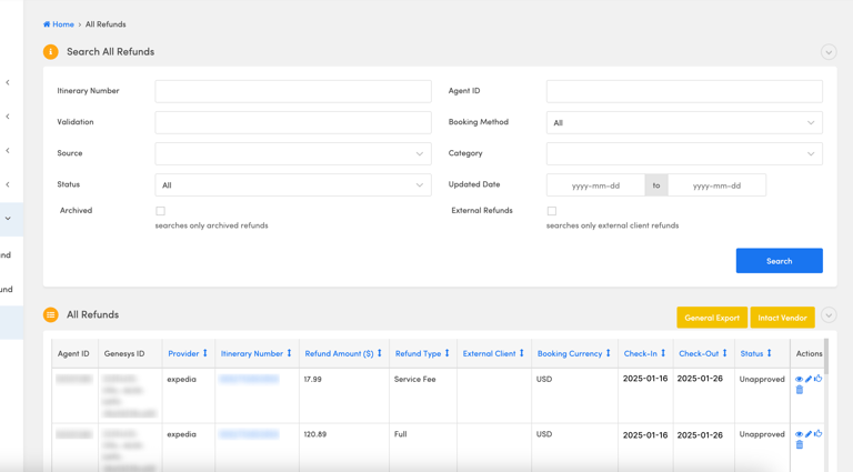
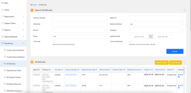
Cluttered Search Experience
The interface included too many input fields, making the search process overwhelming and inefficient.Lack of Simple Search Options
Users preferred a streamlined search by itinerary, but the system didn’t support it intuitively.Inefficient Refund Approval
Refunds had to be approved individually, resulting in slow processing times and repetitive manual work.Outdated Interface
The UI felt visually outdated and lacked a clear visual hierarchy, making it harder for users to scan and prioritize information.
I redesigned the interface with a focus on clarity, speed, and modern UI patterns:
• Single itinerary search field to simplify the experience and allow more space for results.
• Calendar-based filter to easily track refund history by date.
• Status filter + bulk actions, enabling users to approve or unapprove multiple refunds at once.
• Updated visual hierarchy to help users navigate and act with more confidence.
Design Solutions To address these issues


These updates streamline the workflow and save time for specialists like Jesus, while aligning the tool with our latest design standards.

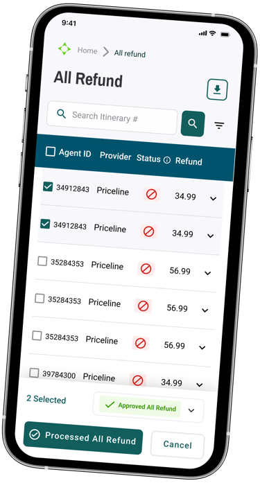
Final Design (Prototype)
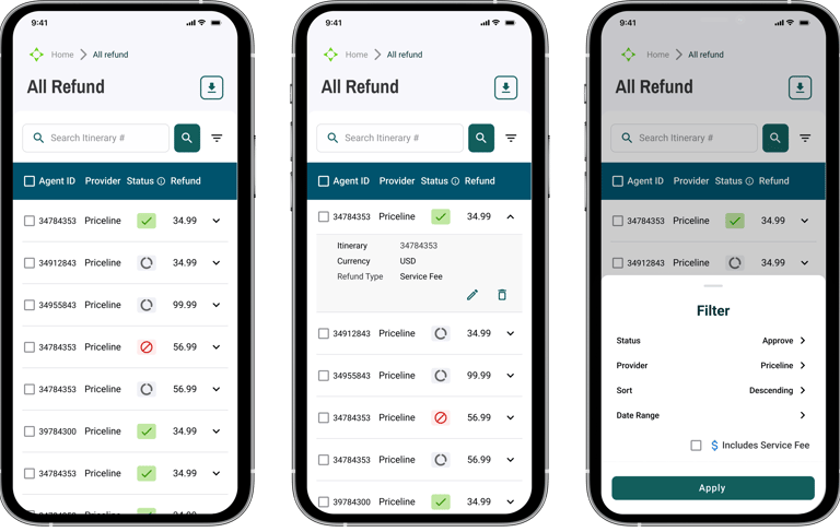
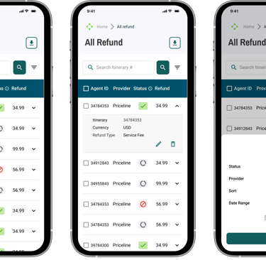


Issue a refund
Refund details
Main Page
Filter Refunds
Select refunds
Key Mobile screens
Feature testing 2
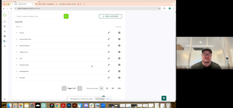
Decision Tree Management Page V1
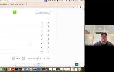
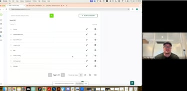
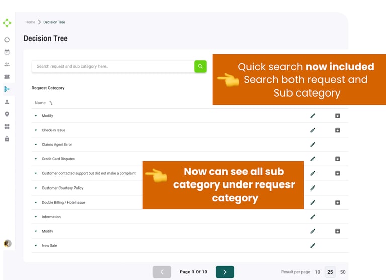
The decision tree is a feature for supervisors to manage and edit the categories related to call information. It helps travel agents select the category that best fits the phone calls they handle with customers.
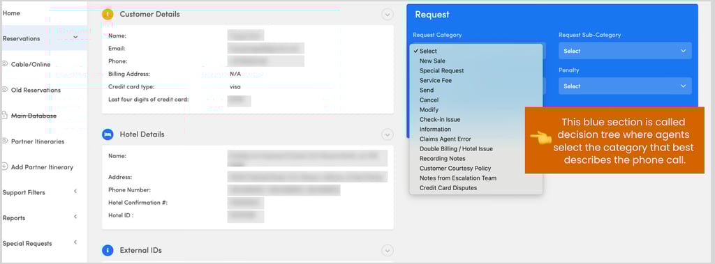
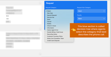
Decision Tree management page is
where managers manage / update the information of this section (Decision Tree)
Design Then & Now
Below you can see the comparison between the old interface Phalanx and the new Cable design on the management Page
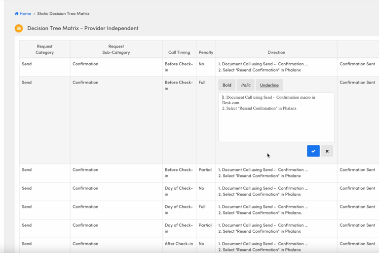
Phalanx Interface (old interface)
New Design Interface
New Design Interface
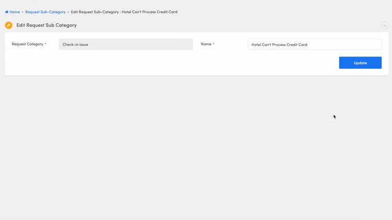
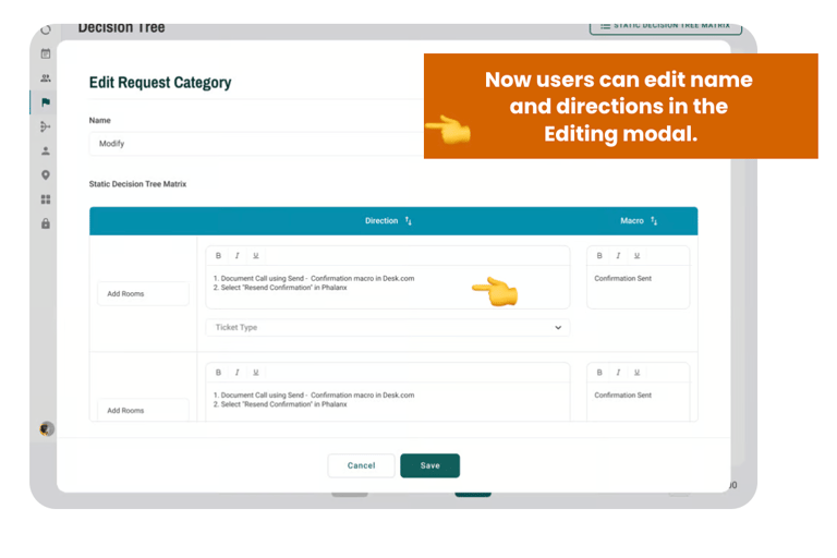
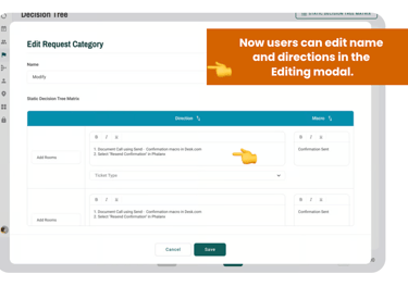
This page is for managing request categories. Updating sub-categories will be handled on a separate page.
This page is for managing request categories. Updating sub-categories will be handled on a separate page, where users can only update info one at a time.
Users can only edit and save one direction one at the time.
This is the Biggest pain point Austin mentioned!

User Journey Map


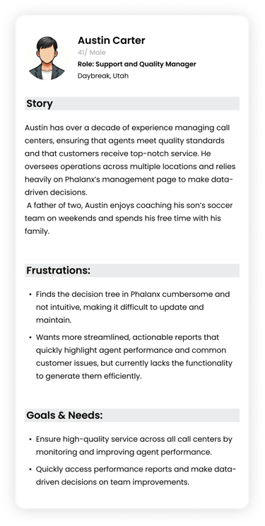
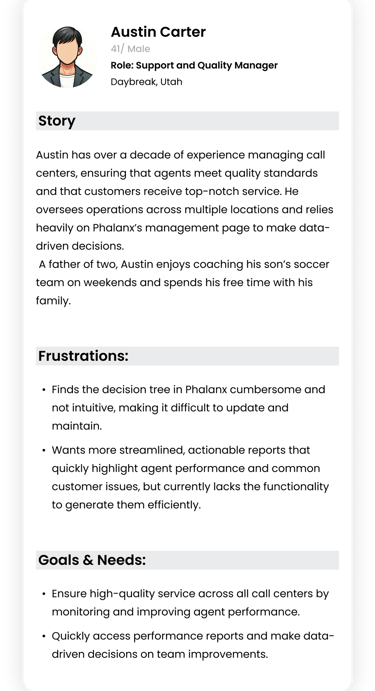
User Persona: Support and Quality Manager
Name: Austin C.
Age: 45
Location: Daybreak, Utah
Occupation: Support and Quality Manager
Family: Married, father of three kids
Austin C. is the only user who is using the decision tree management page right now
-Creating a Subcategory
-Editing an Existing Category:
Key Tasks We Tested
-Creating a New Category

Now we are ready for Austin to test the new design prototype!

First
Second
Third
Fourth
Fifth
Actions
Stage
Thoughts and Feelings
Touch Point
Friction
Opportunities
Observes the interface
Looks around the interface
N/A
N/A
Adds New Category in Decision Tree
Create Category Button
N/A
N/A
Adds New Sub- Category in Decision Tree
Finds Edit button
Deletes a Category
Clicks on Sub-Category listed under the category he just added
Can't add the Sub-Category directly under the main category
Able to let the users to add Sub-Category just directly from there
Clicks on the pen icon
The success message is blocking part of the editing modal.
Make the success popup disappear within a second or find an alternative way to display it
Tries to go to edit to find delete button
It isn't clear that the archive icon was removing the category
Add a delete button or provide a filter to view archive items


Feeling Confident
Feeling Confident
Feeling Confused
A little frustrated
Feeling Confused
"I can't find the delete button "
"It will be cool if the popup only shows a few second "
"I imagine I select here to create a sub category"
Final Designs
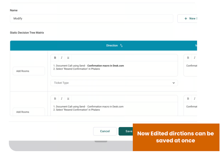
This prototype demonstrates how a user can select a category, edit its name and directions, and save all changes at once. Additionally, the user can search for a category and choose a sub-category to archive as needed
How did I add value?
Redesigned the interface to make it easier for supervisors to edit categories and sub-categories, ensuring changes could be made quickly and with minimal steps.
Simplified Editing for Managers
Improved Success Popup Behavior
Enhanced Search-ability for Efficiency
Refined the success popup to prevent it from blocking critical actions, ensuring smooth task completion without interruptions during the editing process.
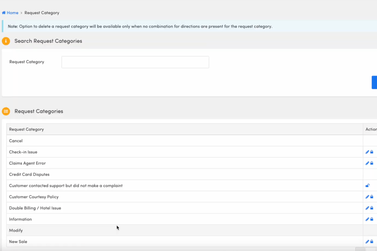
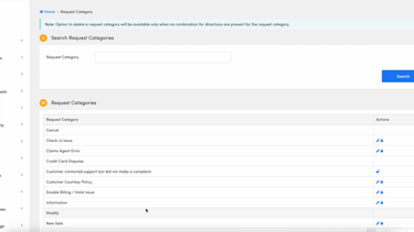
Enabled both categories and sub-categories to be searchable, allowing supervisors to locate and update specific items faster, especially when managing large datasets with over 20 pages of request categories.


Help saving users time
UX improvement from Phalanx to Cable
Editing Directions
Navigating between Pages
Searching Categories/ Sub Categories
Updating Subcategory names
Task
80% faster
Time Saved
How?!
Save 3-5 min (because users can bulk edit + Save)
50%-70% less effort
0-1 click (all in one module)
50% more efficient
1 combined search
Instant edits
Inline editable in same module
Metrics below


This saved me so much time- instead of dreading the update process, I can now do it all in one go
The new layout makes it super easy to see the full structure at once. No more guess or digging around
User feedback


Location: Multiple cities
The rebooking flow will be used in multiple call centers across various locations in South America.
Feature testing 3
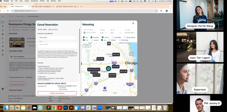
Rebooking Flow V1
Key Tasks We Tested
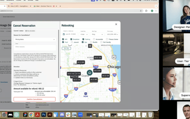
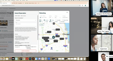
A split-screen layout that shows the hotel cancellation process alongside a map with recommended hotel options.
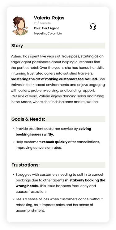
The rebooking flow is designed for in-house Tier 1 travel agents to assist customers in rebooking a hotel after they call to cancel their reservation. This flow enables agents to recommend alternative hotel options, helping to retain sales while also allowing agents to earn commissions.
Teir 1 agents. (Users)
Testing agents 2
User flow 1 testing
User flow 2 testing
sequential flow where the hotel cancellation is completed first, followed by recommendations for alternative hotel rooms
Result
However, they also value the ability to compare prices and explain the differences between the originally booked hotel and the one they are about to book.
Users love the map & pricing comparisons !

Based on their feedback, V2 testing will be updated accordingly!
The results from the user flow testing show that agents appreciate being able to see hotel rooms and prices on the map while speaking with customers.
Side note: Agents want these key details integrated into the interface so they can quickly provide information to customers without having to open multiple windows.